The Design team at iRobot made insightful user experience and market discoveries helping reach new customers and enabling the company’s shift from hardware differentiation alone, to an experience oriented, personalized, customer enablement platform.
Design Manager
iOS + Android Apps
Jan 2019
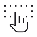
As the Product Design Manager I worked with our Research team to conduct discovery and user testing on a regular basis.
Understand
Diverge
Decide
Prototype
Validate
Leveraging a range of testing approaches including card sorting, paper prototypes, and surveys, we were able to validate our hypothesis that the existing native apps were not meeting critical user needs.
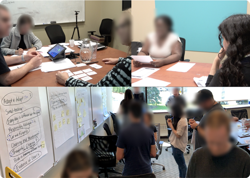
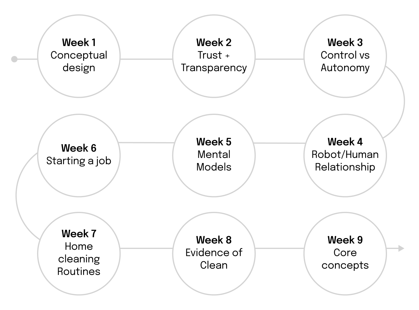
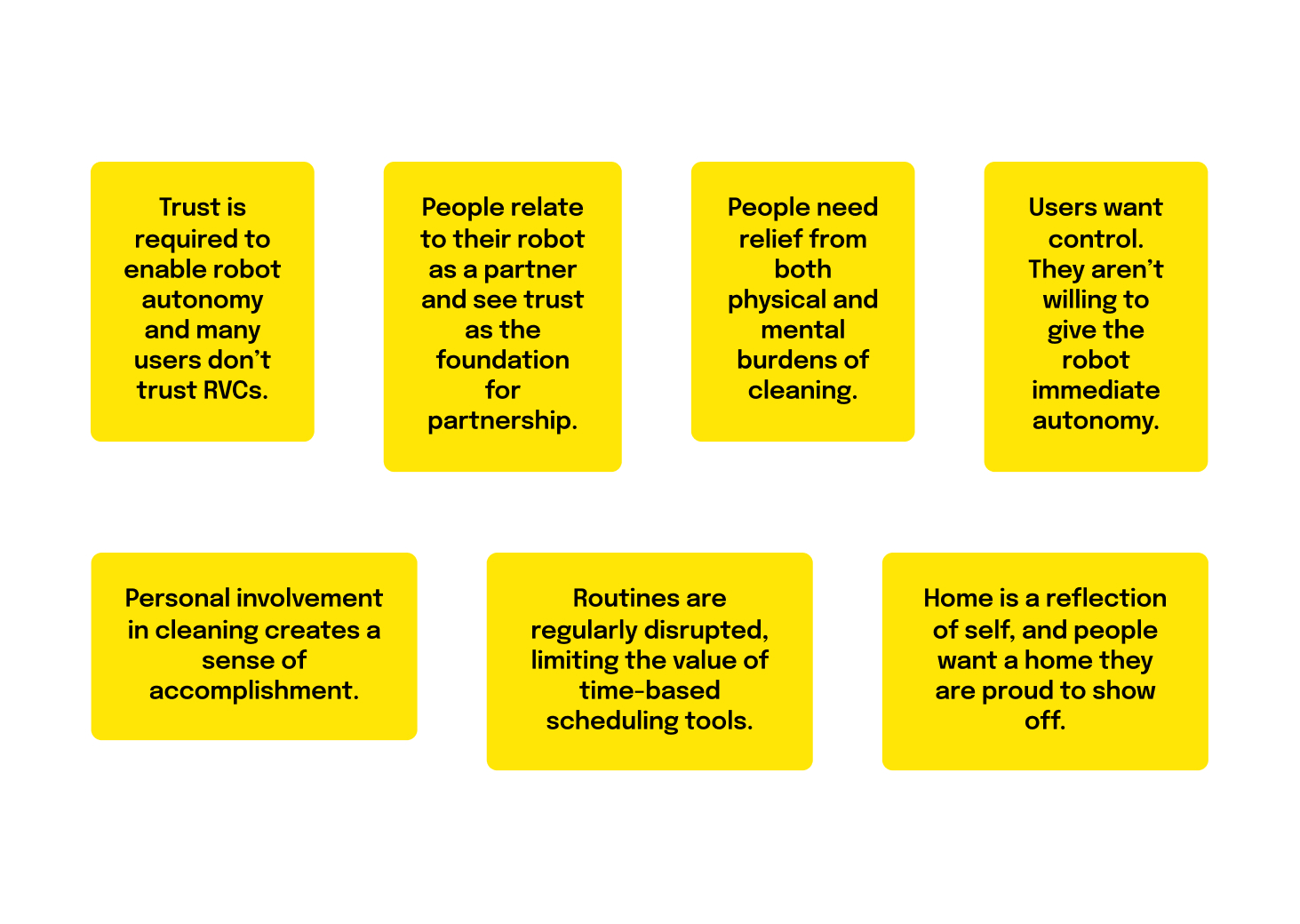
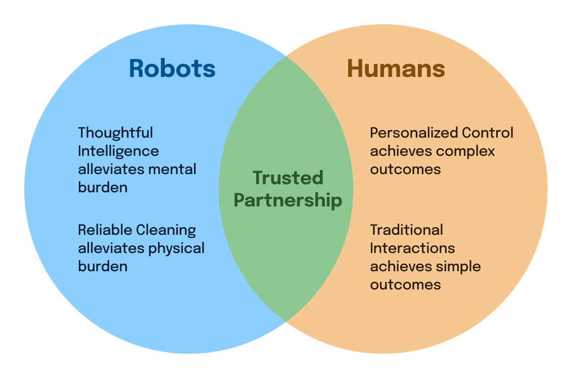
Our preliminary research led to a 9 week cross team program where we discovered new insights into customer behavior, mental models and building trust with our robots. We worked in rapid sprints to ultimately emerge with prioritized user needs and a framework for iRobot’s product market fit.
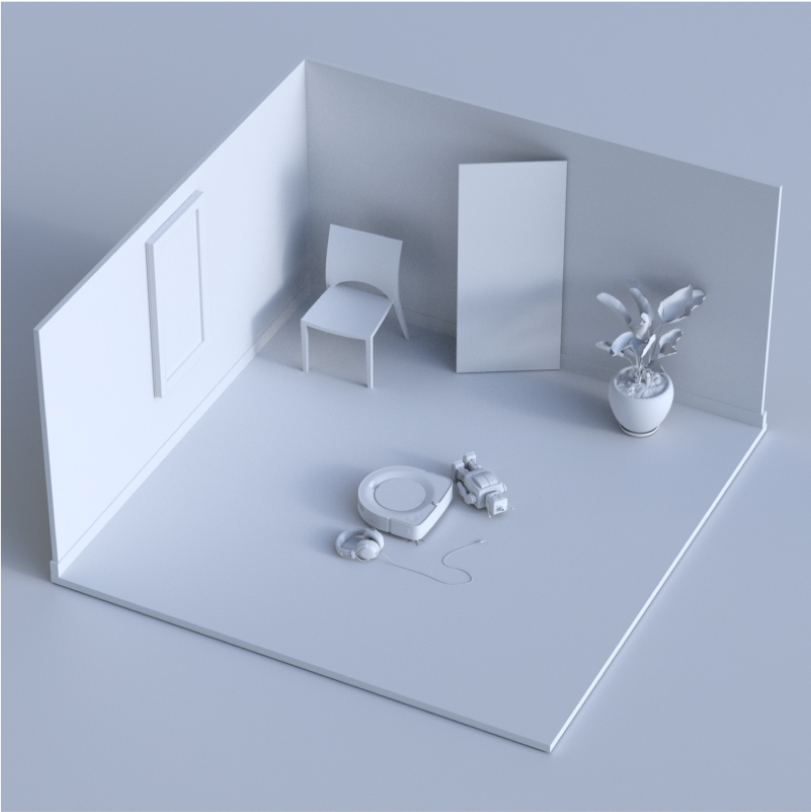
We could now support the types of scenarios happening in the home and alleviate the burden of cleaning for users through a cohesive blend of application design, IOT and hardware design. To jump start our work we asked the team to begin sketching scenarios in support of our discoveries.
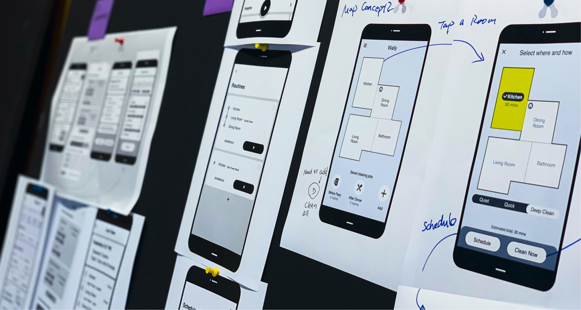
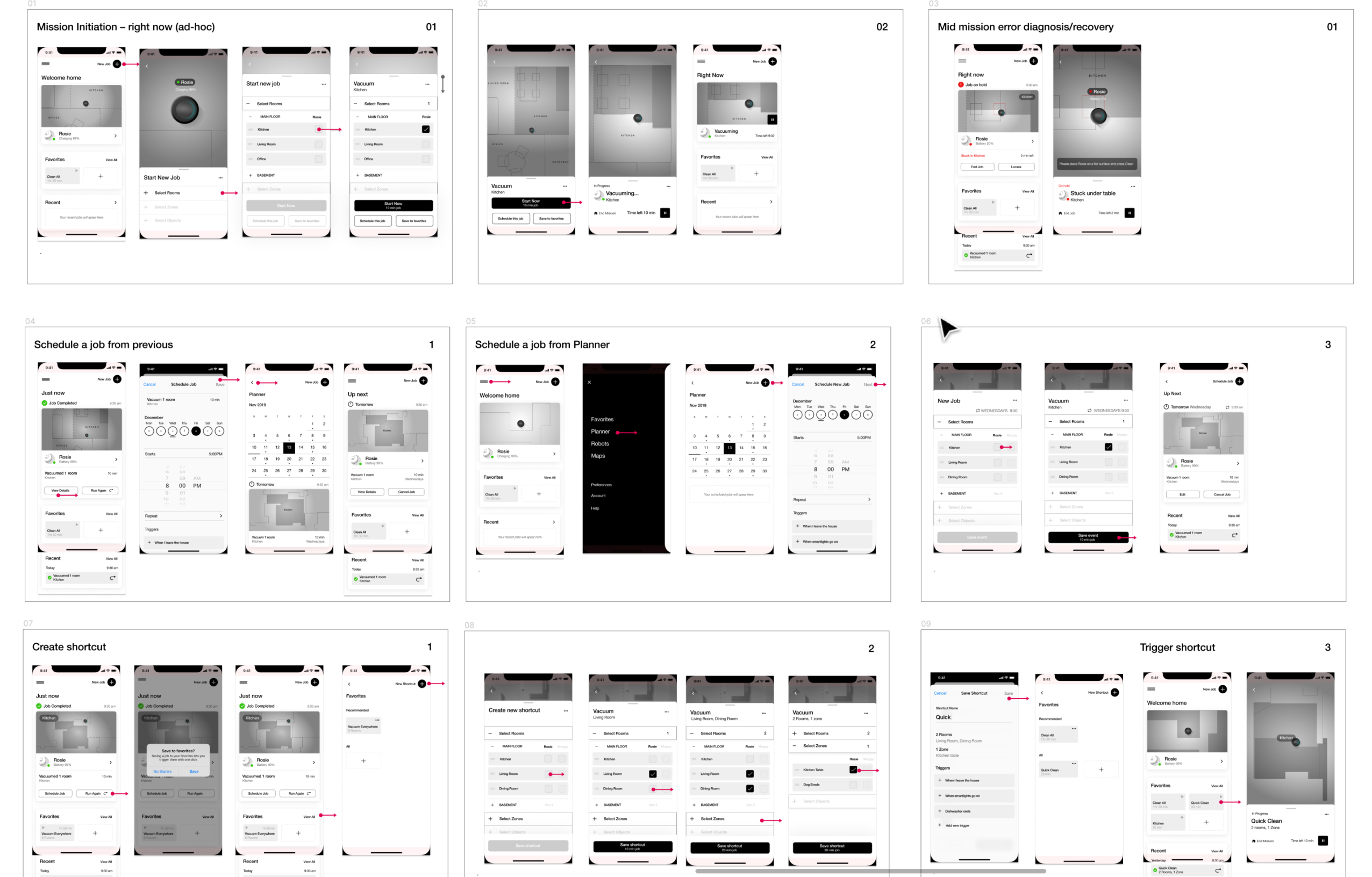
Having built a shared understanding of the user experience gaps and opportunities to better support our users, we began working on low fidelity wireframes and prototypes for further user testing.
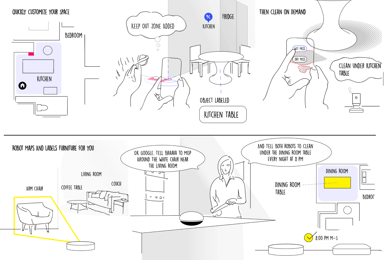
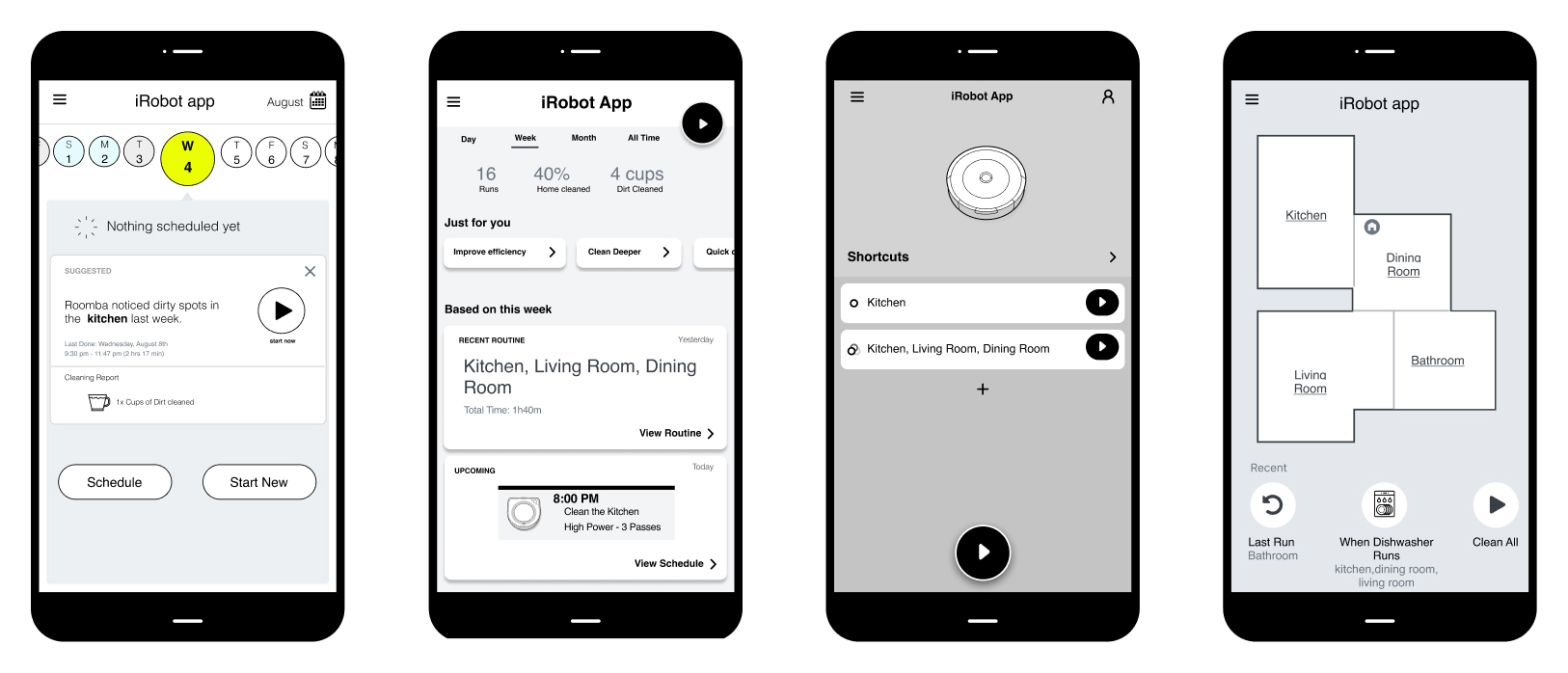
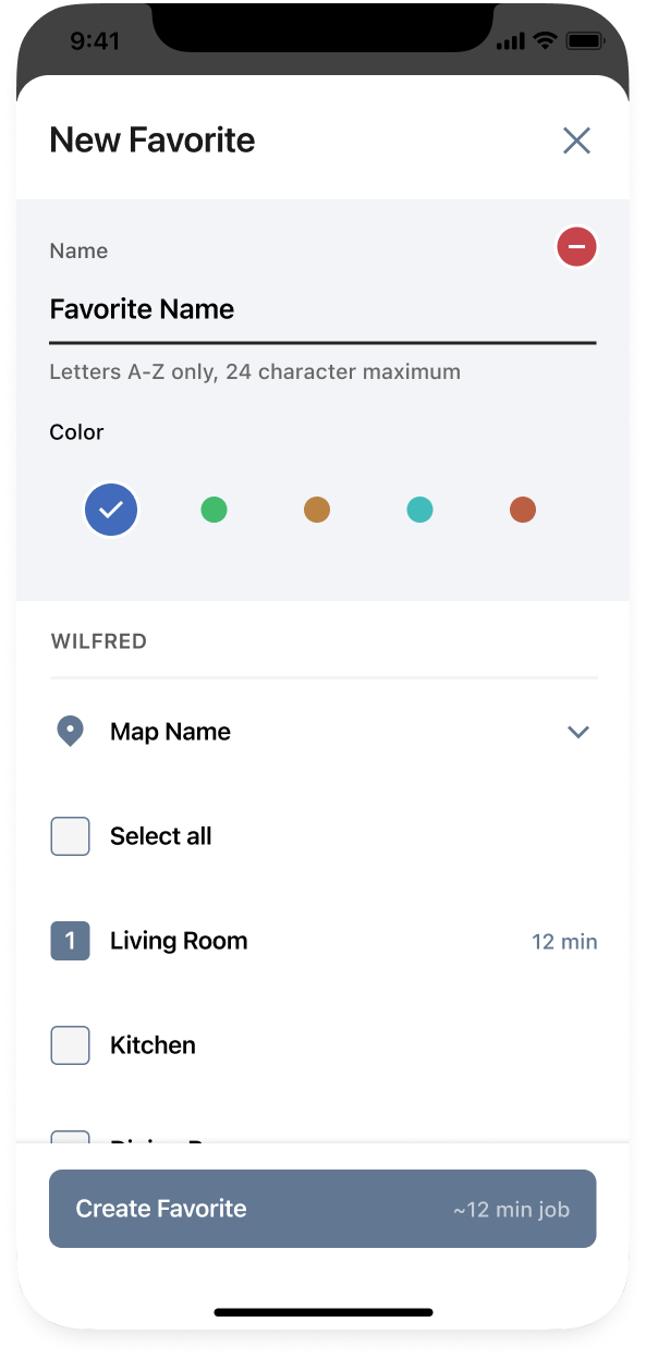
Key areas of focus that emerged from research included control of the robot, cleaning by area, scheduling, personalized routines and “evidence of clean”.
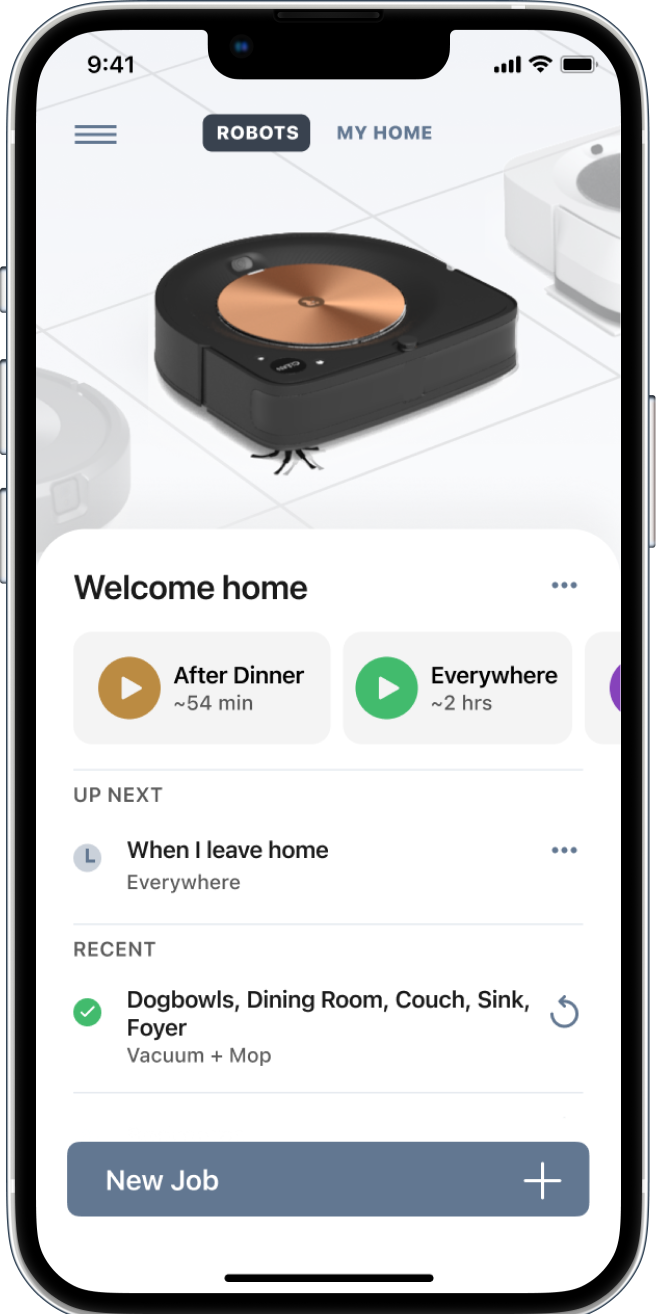
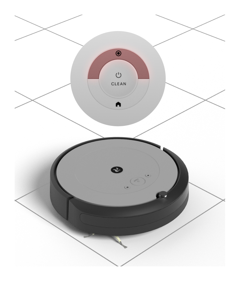
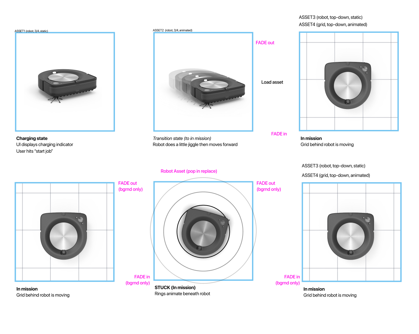
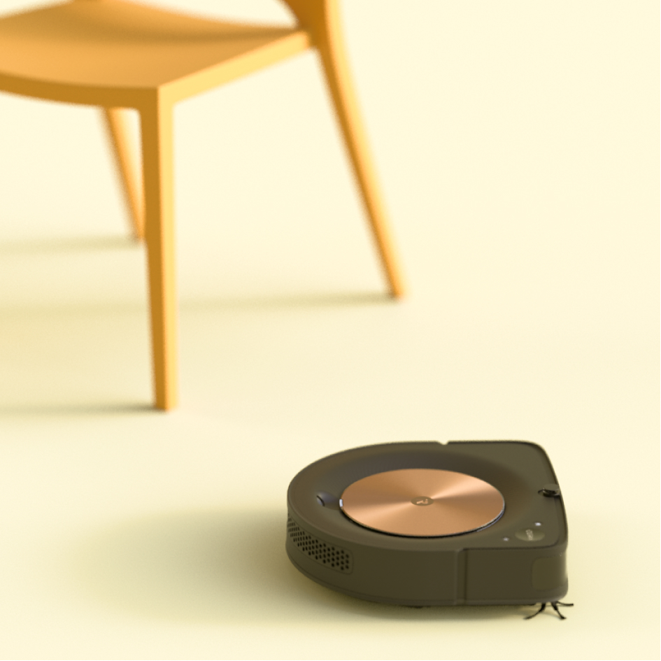
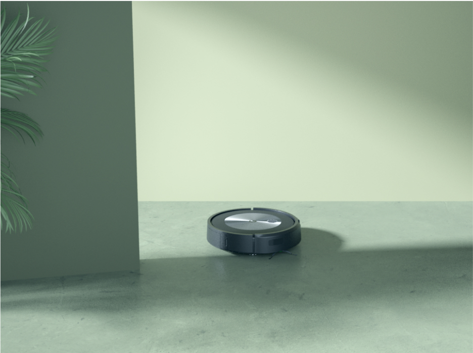
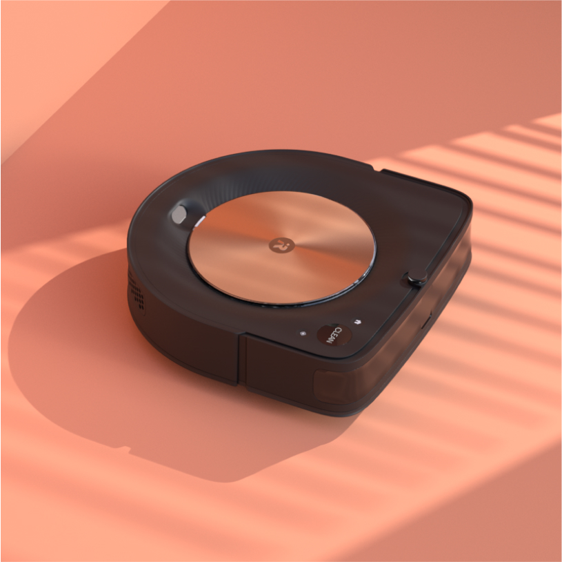
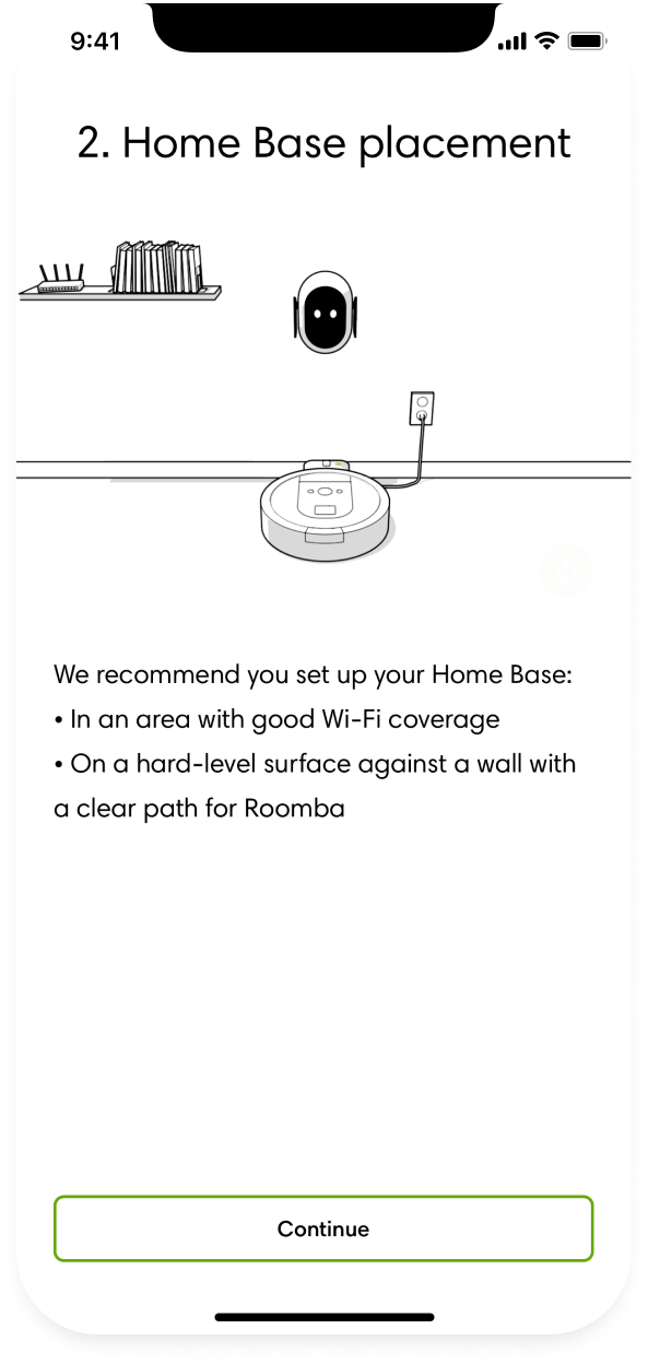
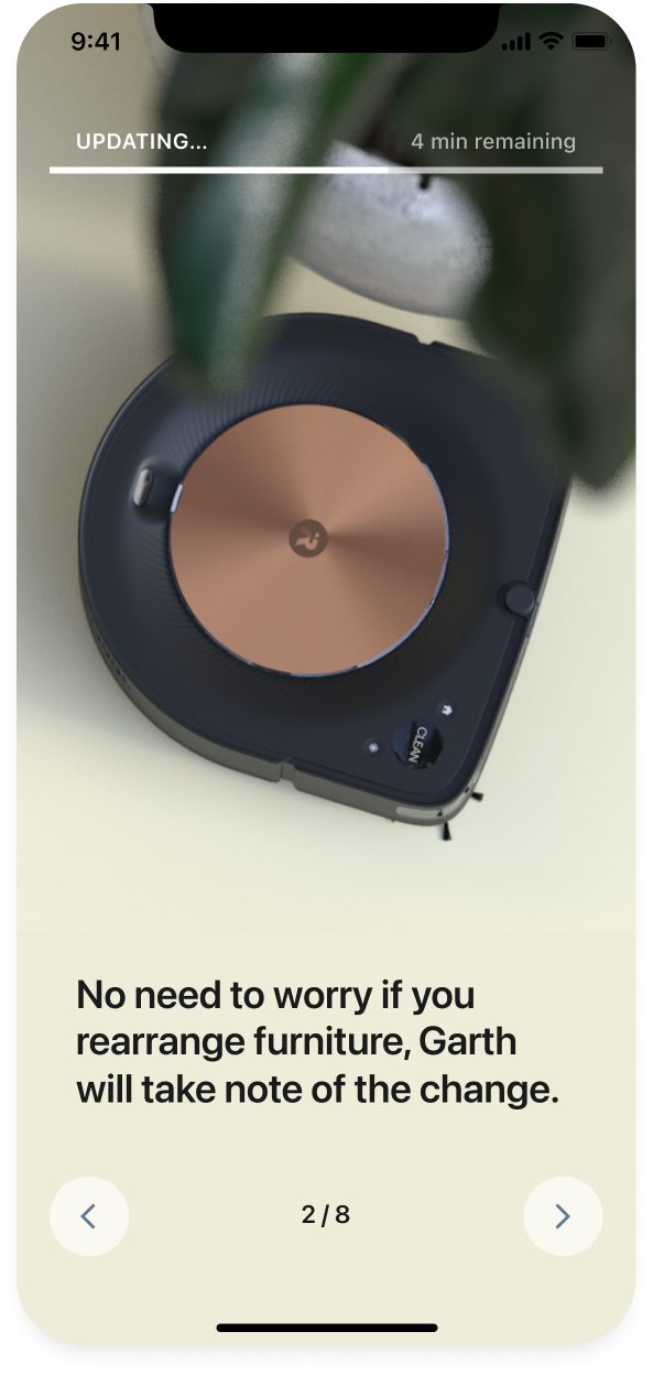
We learned that customers wanted transparency about their robot, it’s behaviors and performance. To support this need, we introduced realistic renderings and animations to help clearly communicate robot state and status.
This new look and approach was adopted for loading screens and onboarding experiences, eventually leveraged in new branding and marketing collateral.
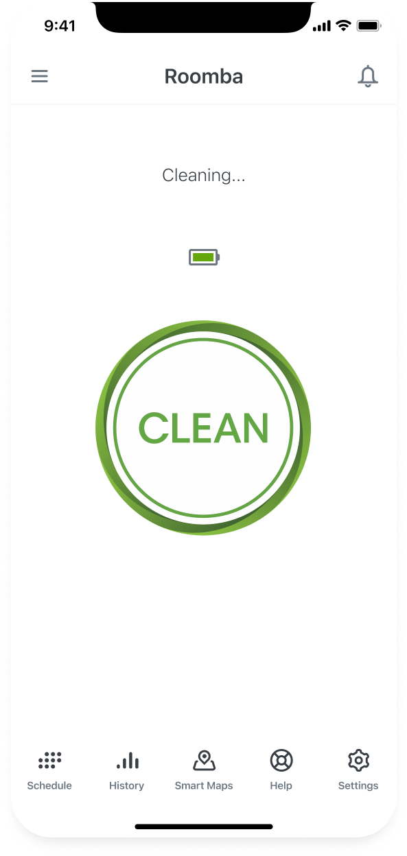
Original app before the redesign
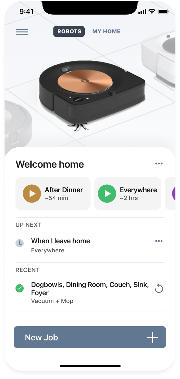
App post redesign
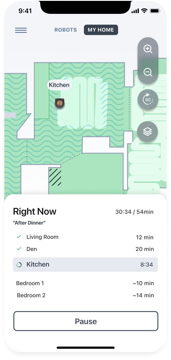
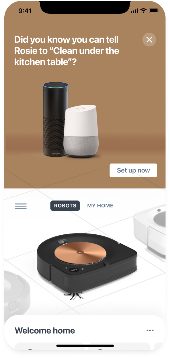
The new experience brought the best of our design research into a new app interface. We gave customers an easy way to control their robots by allowing them to save their popular cleaning areas into Favorites that could then be initiated via the app or through the use of smart speakers (Alexa, Google).
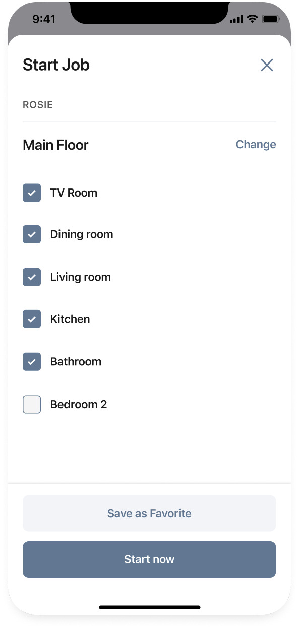
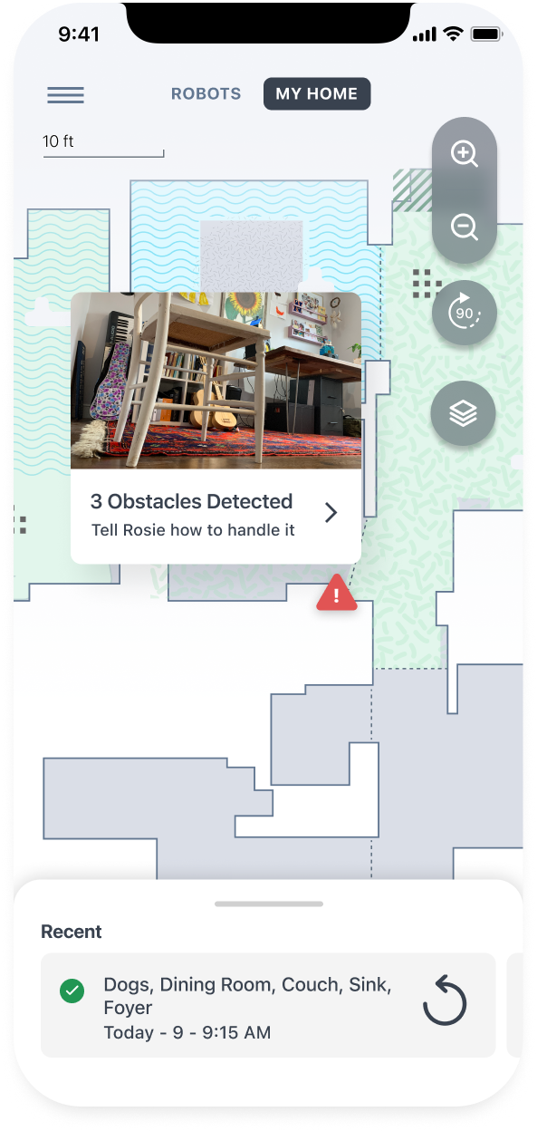
Additional design research was conducted in support of customers who wanted to control the robot to clean by area or object. We tested interactions and visual representations of the home and made incremental changes over time in conjunction with our robot engineering teams.
Customers needed help orienting and familiarizing themselves with their new products. Each robot had unique capabilities and physical differences. Working with our content team and leveraging our realistic look and feel, we designed new user onboarding for each model.